Formatting: Difference between revisions
| Line 464: | Line 464: | ||
==Big header== | ==Big header== | ||
===Getting smaller=== | ===Getting smaller=== | ||
====And smaller | ====And smaller====</pre> | ||
Produces this... | Produces this... | ||
Revision as of 13:23, 22 May 2021
Formatting is - without a doubt - one of the most important things on any wiki. All information on a page should cover every single thing. All wiki pages should look as organized, attractive and precise as possible. A wiki that's attractive enough may bring in more users and edits, and even create more interest in the game itself. A disorganized and sloppy wiki can push users away.
There must be a near-perfect consistency between pages, especially for pages of the same type. For example, all pages of a certain resource should be presented similarly, as well as use the same categories, making page searching even easier. They should also be using the exact same type of infobox, which should also be formatted carefully and consistently.
Proper sentence structure and capitalization should always be taken into account at all times when editing a page. Make sure that paragraphs are not too long as to not create an unattractive wall of text. Line breaks into a new paragraph should (but not always, in some cases) occur when speaking of a new factor about something. Professional, clinical must be used on all pages to the maximum degree:
Proper:
Mountains are natural, rocky structures generated in the world that act as obstructions, but can be interacted with.
Improper:
mOUntains are things that block ur path and can show up a lot, but i haven't seen much......
Much like this page, the very word(s) the topic is about should be bolded only when mentioned for the very first time per page.
Some pages, like the metal one, have icons alongside the text. Images are highly encouraged for almost all pages, but only if they're necessary and properly fit the page. Pages should also link to each other whenever certain words are mentioned for the first time in each page.
Note: This page is constantly being updated. So please check back every now and then.
Categories
A category is, by definition, a class or division of things regarded as having particular shared characteristics. In the case of this wiki, categories are pages that share a similar theme or themes as mentioned before. For example, pages like wood and stone would have the category of Category:Resources. Categories, in source mode, can be added to a page by typing [[Category:category_name]] near the bottom.
Editing and discussions
Pages can be edited in two ways. Simply clicking "Edit" will make the page editable in the sense of how the page will be seen. The second way of editing is clicking "Edit source", which puts the page into its bare-bones makeup by turning the page into just text. In some cases, editing the source of a page is more helpful when there are more detail-oriented things to add, such as the properties of a template.
Either way you edit the page, you can click the "Show preview" button, which will show the end result of the edits made. This should always be used to check for mistakes before saving a page. You can also click "Show changes" to compare your changes to what the page had in the previous edit.
Text Editing Syntax
Common format syntax options are as follows:
| Syntax | Output |
|---|---|
''This is text in italics.''
|
This is text in italics. |
'''This is text is bold.'''
|
This is text in italics. |
<sup>This is superscript text.</sup>
|
This is superscript text. |
<sub>This is subscript text.</sub>
|
This is subscript text. |
<s>This is strikethrough text.</s>
|
|
<code>This is code preview text.</code>
|
This is code preview text.
|
<u>This is underlined text.</u>
|
This is underlined text. |
<small>This is small text.</small>
|
This is small text. |
<big>This is big text.</big>
|
This is big text. |
[[Formatting|This is an internal link.]]
|
This is a link. |
[https://en.wikipedia.org/wiki/Main_Page This is an external link.]
|
This is an external link. |
{{color|lime|This is lime green text.}}
|
lime |
<span style="color: yellow;">This is yellow text.</span>
|
This is yellow text. (with some CSS) |
<span style="color: #ffaefa;">This is pink text.</span>
|
This is pink text. (with some CSS) |
There is a line break...<br />...between these lines of text.
|
There is a line break... ...between these lines of text. |
This example in-game hotkey is {{hotkey|key=Ctrl+F10}}.
|
This example in-game hotkey is {{{1}}} . |
|
|
|
;Definition
|
;Definition
|
Lastly, you can put many lines of text in <pre> tags. Which creates the following:
This is a bunch of text surrounded in pre tags.
But note that this takes up the entire width of the page.
Always take note of that.
Again, this is done by putting <pre> and at the start and end of the text respectively.
The <pre> tag at the end has a slash in it, like other tags.
Using pre tags is a good way to show text that explain how to type something out, such as a template or code of any kind. You will see more pre-tag text in the examples below.
Tables (first variant)
Some information may need to be added in the form of a table. A standard table follows this format:
{| class="wikitable"
|-
! Header 1
! Header 2
! Header 3
|-
| Info 1.1
| Info 1.2
| Info 1.3
|-
| Info 2.1
| Info 2.2
| Info 2.3
|-
| Info 3.1
| Info 3.2
| Info 3.3
|}
Which would produce the following:
| Header 1 | Header 2 | Header 3 |
|---|---|---|
| Info 1.1 | Info 1.2 | Info 1.3 |
| Info 2.1 | Info 2.2 | Info 2.3 |
| Info 3.1 | Info 3.2 | Info 3.3 |
With some CSS knowledge, tables can have some interesting customization, such as this:
{| class="wikitable" style="width: 500px; text-align: right; border: 2px solid #00ff00"
|-
! Header 1
! Header 2
! Header 3
|-
| Info 1.1
| Info 1.2
| Info 1.3
|-
| Info 2.1
| Info 2.2
| Info 2.3
|-
| Info 3.1
| Info 3.2
| Info 3.3
|}
Which produces this:
| Header 1 | Header 2 | Header 3 |
|---|---|---|
| Info 1.1 | Info 1.2 | Info 1.3 |
| Info 2.1 | Info 2.2 | Info 2.3 |
| Info 3.1 | Info 3.2 | Info 3.3 |
Tables (second variant)
There is another way tables can be made, and the format is as follows:
{| class="wikitable"
! colspan="2" | Header
|-
| colspan="2" | Data 1.1
|-
| colspan="2" | Data 1.2
|-
|| Info A || Info B
|-
|| Part 1 || Part 2
|-
| colspan="2" | Data 1.3
|}
Which produces the following:
| Header | |
|---|---|
| Data 1.1 | |
| Data 1.2 | |
| Info A | Info B |
| Part 1 | Part 2 |
| Data 1.3 | |
The format of this second table makes CSS customization much easier for, as seen here:
{| class="wikitable" style="width: 300px;"
! colspan="2" style="background-color: darkred;" | Header
|-
| colspan="2" style="background-color: #559955;" | Data 1.1
|-
| colspan="2" style="color: yellow; background-color: #336633;" | Data 1.2
|-
| style="color: grey; background-color: #555; text-decoration: underline;" | Info A || style="color: blue; background-color: #555; text-decoration: underline;" | Info B
|-
| style="background-color: #999; | Part 1 || style="background-color: #999; | Part 2
|-
| colspan="2" | Data 1.3
|}
...which creates the following:
| Header | |
|---|---|
| Data 1.1 | |
| Data 1.2 | |
| Info A | Info B |
| Part 1 | Part 2 |
| Data 1.3 | |
Aligning tables
Tables can also be configured to not only align itself to the left or right of the page, but also have text right beside them, instead of over or under them. This even allows multiple tables to be side by side. This is done by simply changing class="wikitable" to class="wikitable floatleft" or class="wikitable floatright". The end result concerning the text can be seen here:
| Left Table | |
|---|---|
| Data 1.1 | |
| Data 1.2 | |
| Info A | Info B |
| Part 1 | Part 2 |
| Data 1.3 | |
Extra text that is beside the table.
![]() Here is more text with a wood icon to show that even images align properly.
Here is more text with a wood icon to show that even images align properly.
![]() And one more icon with more text just for good measure.
And one more icon with more text just for good measure.
![]() That was a lie, this is the last icon with more text.
That was a lie, this is the last icon with more text.
When putting tables side by side, the tables after the leftmost one must not have the added floatleft or floatright text. This can present a problem, however. As you can see, the second table is slightly misaligned. This proves that using such a feature for tables works better with text than it does other tables. Luckily, there's a workaround for this...
| Left Table | |
|---|---|
| Data 1.1 | |
| Data 1.2 | |
| Info A | Info B |
| Part 1 | Part 2 |
| Data 1.3 | |
| Right Table | |
|---|---|
| Data 1.1 | |
| Data 1.2 | |
| Info A | Info B |
| Part 1 | Part 2 |
| Data 1.3 | |
The alternate way to have a side-floating table is to add one space after class="wikitable" then type style="float: left;" or style="float: right;", and then the tables should align perfectly. Note that with this method, the other tables do need to have the style="float: left/right;". Sadly, it also creates makes text have a strange alignment:
| Left Table | |
|---|---|
| Data 1.1 | |
| Data 1.2 | |
| Info A | Info B |
| Part 1 | Part 2 |
| Data 1.3 | |
| Right Table | |
|---|---|
| Data 1.1 | |
| Data 1.2 | |
| Info A | Info B |
| Part 1 | Part 2 |
| Data 1.3 | |
This is text that does not perfectly align.
This means that one type of float-align method must be chosen over the other between working with text and working with multiple tables. As a bonus, we will look at how to shift aligned tables off of each other by adding "margin-left: 10px;", which creates this:
| Left Table | |
|---|---|
| Data 1.1 | |
| Data 1.2 | |
| Info A | Info B |
| Part 1 | Part 2 |
| Data 1.3 | |
| Right Table | |
|---|---|
| Data 1.1 | |
| Data 1.2 | |
| Info A | Info B |
| Part 1 | Part 2 |
| Data 1.3 | |
Singular and plural
There might be some confusion whether some page names should be singular or plural. By default, making them singular makes editing a lot easier. For example, when wanting to link to the page about stone, you can simply type [[stone]] to link to it. But if you're talking about stone in a plural sense, such as "the amount of stones needed to built it is much greater", you can type the link out as [[stone]]s with the "s" on the very left and outside of the brackets, as the wiki will parse this as a link, which links to the page with the singular title, but adds an "s" to the link's text.
Now let's look at the inverse of this. There is a page on the wiki titled mountains, a page title with that's plural. When saying something like "not a single mountain could be seen", you'll notice the link is inactive and red, because the "s" was removed. So, properly linking to the page would have to be done like this: [[mountains|mountain]] which is a bit longer what we had to type before. This longer syntax can be a nuisance to keep typing.
It is possible to have both types of pages, and just have one of them redirect to the other. For example, this wiki has both a farm and farms page. The singular page automatically redirects to the plural one. This makes linking to either one much simpler. Note that not every page should have both a singular and plural version just for the title. This should be done when it's most important and/or for certain words.
Capitalization
On the topic of making proper links, note that proper nouns should always be capitalized. When linking to a page, the link must match the case of the page's name. Notice how this very link to the trade depot page by typing [[trade depot]] doesn't seem to work, but the link of Trade Depot works fine. To make the lowercase trade depot work, the link must be typed out like this: [[Trade Depot|trade depot]]
Page redirects
In some cases, it's best to have a page redirect to another to avoid confusion and make browsing much more convenient. Making a redirect page is very simple, just make sure the page doing the redirect has ONLY this text in source mode:
#redirect [[pagename]]
Refreshing
Refreshing a page to see the changes you've made is a more-than-common thing you'll do, but sometimes simply hitting F5 isn't enough. Due to how most browsers are set up, simple refreshes don't properly show changes. This will be the case when changing some images or templates. In cases like this, you must do what's called a "cache refresh", which is pressing Ctrl + F5 instead of just F5.
Uploading different types of animated images is another reason to use a cache refresh.
Adding images
Images can make almost improve any page, assuming the images fit the page and are formatted properly. Images can be added by clicking Upload file in the left sidebar. After choosing an image file to upload, a license for the image must also be selected. If someone has made an image and deserves credit for it, they should be credited in the description. Images, like pages, should also be given proper categories. For example, game icon images must be placed in Category:Icons.
When editing a page in source mode, the syntax of adding an image is [[File:<image_filename.png>|thumb/frame/none|<size>|alignment|caption]].
Note that an image does not need every parameter in the example. For example, some images don't need captions, nor always need to be in thumb/frame mode nor always need to be resized. It's all based on what the user wants the image on the page to look like, and what fits the page the most.
Also note that when showing gif images, they must be presented in the exact pixels of the image as to not break their animation. So if you present a 128×128 gif in a thumbnail resizing it to 100×100, the image will show, but it will not animate. If you want to make a gif image smaller, you will have to resize it in whatever gif program you have. EZGif can also help with this. Also, please put gif images in the motion pictures category.
Gallery
If a page has multiple images, it's best to put them in a gallery. If images aren't put in a gallery, then images will just be stacked vertically to one side, which does not look good. Putting them in a gallery solves this issue by making images sit near each other in an organized fashion. Galleries are made by typing the following:
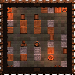
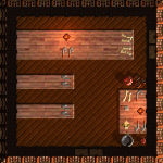
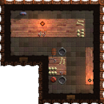
<gallery widths="150px" heights="150px">
File:warehouse_preview.png|Warehouse image.
File:hunter_preview.png|Hunter image.
File:cannibal_preview.png|Cannibal image.
</gallery>
Which produces the following:
-
Warehouse image.
-
Hunter image.
-
Cannibal image.
Templates
Templates are pre-made bits of code that can be inserted into pages. Editing the template page will change how it appears on all pages, so it's wise to do some testing before using them. All template pages should include instructions on how to use and properly format them. So be sure to add instructions yourself if you make a template.
All templates are added with two left curly brackets, and end with two right ones. So all templates added to a page look like this: {{template_name}}.
Page management templates
Some pages might have very little information, so {{stub}} must be placed at the top of the page.
Some pages may have a decent amount of information, but are still not quite finished, so {{construction}} must be placed at the top of the page.
If the page is about a feature that is planned for Songs of Syx but is not yet implemented, then an {{upcoming}} template is needed.
If a page needs at least one image but is missing one, then add {{needimage}} to the top of the page.
Some pages might need a combination of these templates, so they should all be added to the very top of the page, but perfectly sitting right above and below each other, which should make them sit seamlessly on top of each other when the page is saved.
There may be a lot of elements in a page that might scramble how text appears, and you might want the text to appear below all of it. You can do this by adding the {{clear}} template. Let's look at an example:
...and so is the second line of text.
...and so is this third line.
But what if you wanted to cut that short, and just have your text just skip right to below the image?
That can be easily done by adding {{clear}} after the end of the text. So let's look at this next example:

But if we add
{{clear}} right at the end of this very line.The third of text is now below the image. As the templates clears out everything ahead of it and finds a fresh new line.
Marking articles for deletion
If you feel that an article should be deleted, then put {{delete|reason = reason for deletion.}} at the top of the page. Please only do this if an article is breaking the rules or is added through pure trolling or vandalism.
Page combining
Some topics can fit into one single page, while others should have multiple pages or in some cases, have both. If something has a mid-to-high amount of important information by itself, it can have its own page, unless it's more of a sub-topic of something else, then it doesn't need a page of its own. A good example of this topic are the races in Songs of Syx. You'll notice the wiki has a page for all three races: the Cretonians, Dondorians and Cantors. However, these races are also mentioned on the citizens page. This is because the citizens page encompasses the three races, but each race has more than enough information for their own pages as well. You'll also notice that the citizens page doesn't contain as much information on each race nearly as much as the individual pages about them, this is because adding all the info of those separate pages would make the citizens page far too long.
If each individual race didn't provide much information, there wouldn't need to be separate pages for them, and the only information about them would only be on the citizens page.
Discussions
There might be a disagreement between users about what content should be added to a page. This can be rectified by using the "discussion" tab of a page and asking what information is okay to add. When you add a post, make sure to sign it. This is done by typing ~~~~ at the end of your text in source mode.
Please see the actual discussion section of this page to see a proper example.
Headers
Headers, in "edit source" mode, are made by using the equals key, like this: ==Header==. The more equals signs added to each sign, the smaller the header will become. The example text you see here...
==Big header==
===Getting smaller===
====And smaller====
Produces this...
Big header
Getting smaller
And smaller
Table of Contents
Note that creating enough headers in a page will cause a Table of Contents to appear. If said Table doesn't fit the page very well, it can be removed by adding __NOTOC__ anywhere in the page. Adding __FORCETOC__ will force the Table of Contents to appear at the default location, while typing __TOC__ will add the table to a preferred location instead of the default one.
